Showing posts with label FixThatGraph!. Show all posts

Sunday, May 24, 2015

469: Fix this Graph #ILostCount


This graph needs a lot of work.

What information is being presented?
What is the best way to display this information?
Does this graph rely too much on the reader's knowledge of the city?

source.

Monday, January 26, 2015

382: Arena Funding


This graph is distorted.
  • How is it distorted?
  • What change in its message is achieved by this distortion?
  • How would you fix it?

Sunday, January 25, 2015

381: Just About Half


This graph is distorted.
  • How is it distorted?
  • What change in its message is achieved by this distortion?
  • How would you fix it?
  • What would have happened if they'd had more than 50%?

Saturday, January 24, 2015

380: Standing Tall


This graph is distorted.
  • How is it distorted?
  • What change in meaning is achieved by this distortion?
  • How would you fix it?

Friday, January 23, 2015

379: We All Scream for My Screen

This graph is distorted.
  • How is it distorted?
  • What change in meaning is achieved by this distortion?
  • How would you fix it?
  • Of the several ways to adjust this graph, which is best?

Thursday, January 22, 2015

378: Irish Ayes are Happy ...


This graph is distorted.
  • How is it distorted?
  • What change in meaning is achieved by this distortion?
  • How would you fix it?

Wednesday, January 21, 2015

377: Oil in the Water


This graph is distorted.
  • How is it distorted?
  • What change in meaning is achieved by this distortion?
  • How would you fix it?

Tuesday, January 20, 2015

376: Graduation Rate Growth


This graph is distorted.
  • How is it distorted?
  • What change in its message is achieved by this distortion?
  • How would you fix it?

Wednesday, October 15, 2014

Wednesday, April 16, 2014

101: Gun Deaths in Florida


You can take it from here ...

Tuesday, April 8, 2014

88: Truly Bad Graphics

This graph is biased in what way?
How could you change it to bias it the other way?


Sunday, April 6, 2014

Saturday, March 15, 2014

61: Textbook Error

You can tell by the font this is a textbook. You can tell by my tone that this is an error.
Fix that Graph ... Fix That Question.

Sunday, February 9, 2014

23: Graphicacy and the Science Fair

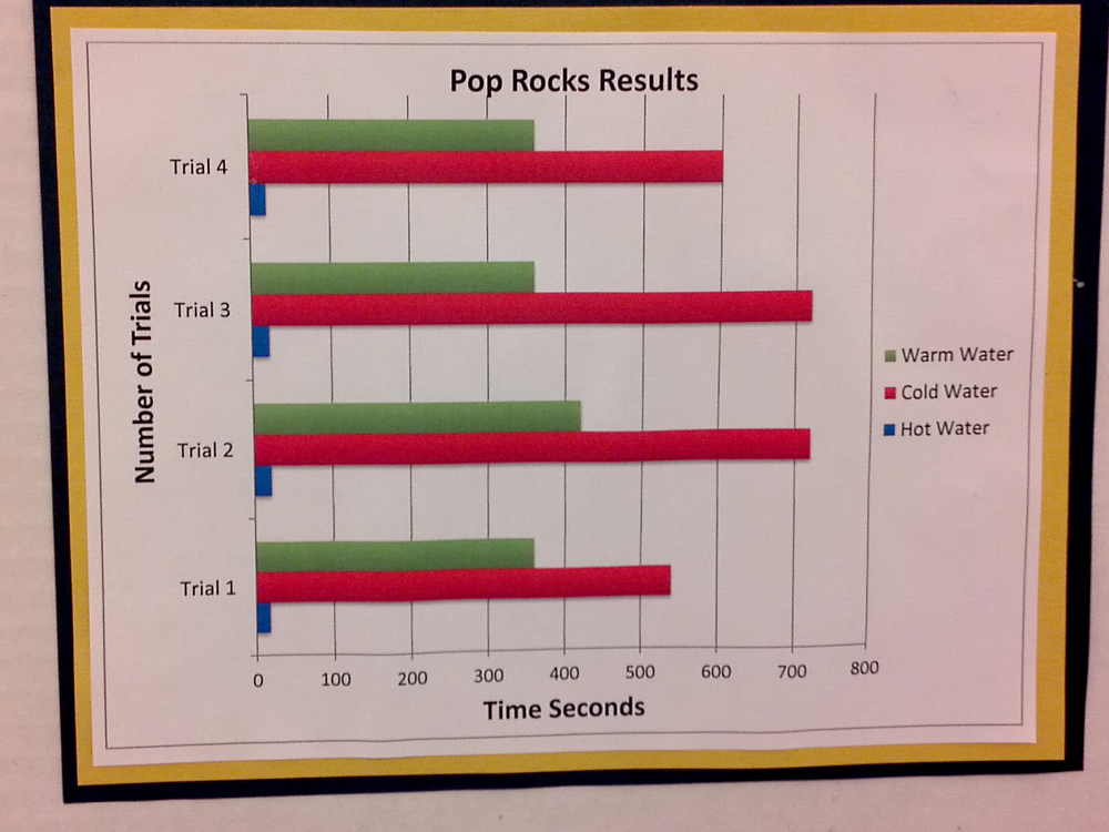
Wandered around Science Fair, found this ...


Here's the data.


Trial 1 Trial 2 Trial 3 Trial 4
Hot Water 30 25 25 25
Cold Water 600 720 720 540
Warm Water 350 360 420 360

The basic experiment was to have water of differing temperatures and see how long it takes for a bag of pop rocks to fully dissolve. Discuss this experiment.

Graphicacy is the ability to create a visual (usually in graph form) that communicates well with the reader. Generally, if it takes the reader more than a few seconds to figure out what's going on, it's a bad diagram or graph.
  1. Is this the best type of graph for this data?
  2. How is it communicating badly: what normal assumptions and expectations does this graph contradict?
  3. What errors did the creator make?
  4. What would you do to improve this graph?