Showing posts with label Graphicacy. Show all posts

Wednesday, April 8, 2015

425: Filling Bottles


Imagine you were filling each bottle with water, poured at a constant rate.

Which bottle fits which height-time graph.
Draw the bottles for the remaining graphs.

source.

And don't forget https://teacher.desmos.com/waterline 

Friday, August 29, 2014

233: Vegetable Zen


100 students were surveyed about their preferences for bell peppers (capsicum), carrots and spinach, with the following results:

①  72 students said they like bell peppers, and 36 students said they like only bell peppers.
②  41 students said they like carrots, and 9 students said they like only carrots.
③  31 students said they like spinach, and 3 students said they like only spinach.
④  9 students said they like neither bell peppers, nor carrots, nor spinach.

What is the best way to model/analyze this survey data?

Graphically (and what type of graph)?
Tables? How?
Algebra?


source.

Tuesday, April 8, 2014

88: Truly Bad Graphics

This graph is biased in what way?
How could you change it to bias it the other way?


Monday, March 31, 2014

78: That Set

What's this all about, then?


An updated version:


And a video zooming in ... 2 * 10275


Wednesday, March 26, 2014

72: Trends in the Data

FiveThirtyEight had this graph and the comment. "It looks to me as if Mr. Cain had been on a positive trajectory before, perhaps having moved up to about 28 percent of the Republican vote."


Is that blue trendline reasonable?

Some background information. From Wikipedia, "Cain ran as a Washington outsider and became a front-runner in the race in the fall of 2011. However, Cain's support plummeted after several women alleged that he had engaged in sexual harassment or, in one case, a 13-year extramarital affair. Cain and his wife unequivocally said the accusations were false, but Cain, citing the toll the allegations had taken on his family and his political support, suspended his campaign on December 3, 2011."

Tuesday, March 18, 2014

Wednesday, March 12, 2014

55: The Fastest Way Down.

Where is the steepest part of this bowl?
What is that slope?
What is the angle in degrees?
(Click to embiggen)


Wednesday, March 5, 2014

48: The One Where We Label Axes.

Why are coordinate axes perpendicular?
Do they have to be?
What if there are more than two dimensions?

Sunday, February 9, 2014

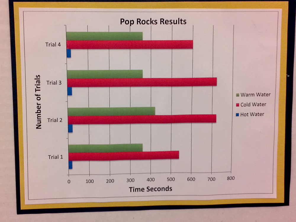
23: Graphicacy and the Science Fair

Wandered around Science Fair, found this ...


Here's the data.


Trial 1 Trial 2 Trial 3 Trial 4
Hot Water 30 25 25 25
Cold Water 600 720 720 540
Warm Water 350 360 420 360

The basic experiment was to have water of differing temperatures and see how long it takes for a bag of pop rocks to fully dissolve. Discuss this experiment.

Graphicacy is the ability to create a visual (usually in graph form) that communicates well with the reader. Generally, if it takes the reader more than a few seconds to figure out what's going on, it's a bad diagram or graph.
  1. Is this the best type of graph for this data?
  2. How is it communicating badly: what normal assumptions and expectations does this graph contradict?
  3. What errors did the creator make?
  4. What would you do to improve this graph?