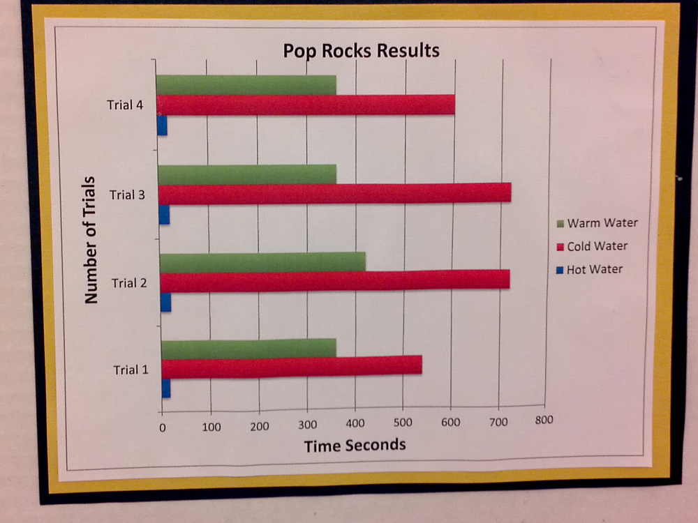
Here's the data.
| Trial 1 | Trial 2 | Trial 3 | Trial 4 | |
|---|---|---|---|---|
| Hot Water | 30 | 25 | 25 | 25 |
| Cold Water | 600 | 720 | 720 | 540 |
| Warm Water | 350 | 360 | 420 | 360 |
The basic experiment was to have water of differing temperatures and see how long it takes for a bag of pop rocks to fully dissolve. Discuss this experiment.
Graphicacy is the ability to create a visual (usually in graph form) that communicates well with the reader. Generally, if it takes the reader more than a few seconds to figure out what's going on, it's a bad diagram or graph.
- Is this the best type of graph for this data?
- How is it communicating badly: what normal assumptions and expectations does this graph contradict?
- What errors did the creator make?
- What would you do to improve this graph?
My thoughts:
ReplyDelete1. No, I would use a single line chart with three lines (Cold, Warm, Hot), with four points for each line (one for each trial).
2. First, I'd go in order of increasing temperature (Cold, Warm, Hot, instead of Cold in the middle). Second, I'd make Cold blue, Hot red, and I dunno, maybe plaid for Warm.
3. The values from the data and the graphs don't match (e.g., for Cold, Trials 1 & 4 are swapped), and should be corrected.
4. Make all the changes I just suggested ;-)